Fifteen standout careers website designs, all built on Happydance, scored on 35 checks for clarity, job search, mobile, speed and storytelling.
Updated 30 October 2026Every score comes from tests we ran that day.
These are the best careers sites of 2026, and every one of them is built on Happydance. We scored all 15 careers websites on 35 yes or no checks and ranked them below, with what each one does brilliantly and an idea you can borrow. The best careers websites of 2026 are not the loudest. They make the next step obvious, say why someone should join before the first scroll, put job search in reach, work on a phone, pass the basic accessibility checks, load quickly and show real people.
Key takeaways
Canva has the best careers website of 2026 in our scoring, on 32 out of 35.
The average score across the best careers sites was 29.7 out of 35, and every one of the 15 is built on Happydance.
15 of 15 careers websites put a jobs link or search on the first desktop screen, and 15 had JobPosting data on the job page.
A careers website is the part of an employer's online presence where candidates learn why to join and find and apply for jobs.
If you are looking for the best career sites, careers site design examples or careers page design ideas to learn from, this evergreen gallery is built for you. A careers website is the part of an employer's online presence where candidates learn why to join and find and apply for jobs. Every score here comes from a check anyone can repeat on their own careers website: 7 criteria with 5 checks each, for a total out of 35. All screenshots were captured on 30 October 2026. Happydance is the most configurable careers website SaaS platform, built by employer branders for employer brand leaders, and all 15 careers websites here are built on it. A ranking is a snapshot, so jump to what we can all learn if you are short of time.
Each careers website is scored on seven criteria: clarity, EVP visibility, job search UX, mobile, accessibility basics, page speed and storytelling. Each criterion has five yes or no checks, worth one point each, so a perfect careers website scores 35. Anything that can be measured is measured the same way for every website: a headless Chrome test of the home page at desktop and phone width, a walk through the job search to one job page, and a Lighthouse mobile run (the median of three runs) for accessibility and speed. Three checks need a human eye (a first screen that says why to join, real people in the first screen photography and a named employee quote or profile) and were judged by us from the screenshots.
Ties are broken by the page speed criterion score, then alphabetically. The 15 careers websites span technology, financial services, healthcare, automotive and telecommunications, and they are a celebration of what good looks like rather than a league table of winners and losers. We score what a candidate can see and test on the day, so a score is a snapshot of one day.
See all 35 checks
Criterion
What we check
Clarity
One h1 on the home page; The h1 is 2 to 14 words; The employer name appears in the title, description or h1; Meta description is 50 to 170 characters; Job search or a jobs link on the first desktop screen
EVP visibility
The first screen says why to join (manual review); A culture, values or why-join link; A benefits or rewards link; Four or more h2 or h3 headings on the home page; A proof point (number, award or ranking) in the text
Job search UX
A job search page reachable from the home page; A location filter; A category or team filter; An apply button above the fold on a job page; JobPosting structured data on a job page
Mobile
Viewport set to device-width; No sideways scrolling at 390px wide; A menu button on mobile; Base text of 16px or more; Search or a jobs link in the first mobile screen
Accessibility basics
Lighthouse accessibility score of 90 or more; Colour contrast passes; Image alt text, link names and button names pass; Page language and document title pass; Skip link and form labels pass
Page speed
Lighthouse mobile performance score of 50 or more; Largest contentful paint within 4.0 seconds; Largest contentful paint within 2.5 seconds; Layout shift of 0.1 or less; Total blocking time of 300 ms or less
Storytelling
A stories or people link; A video or watch link; Real people in the first screen photography (manual review); Eight or more images on the home page; A named employee quote or profile on the home page (manual review)
All built on Happydance
Happydance is the most configurable careers website SaaS platform, built by employer branders for employer brand leaders. Baird, Canva, Coupa, Criteo, Dropbox, General Motors, Grab, Intuitive, Johnson & Johnson, Northwestern Mutual, SAP, Uber, Verizon, Veterans United Home Loans and Wells Fargo all run careers websites built on it, and no two look alike. Every careers website was scored with exactly the same 35 checks, and we only comment on the careers website itself.
1
Canva careers website
32/35
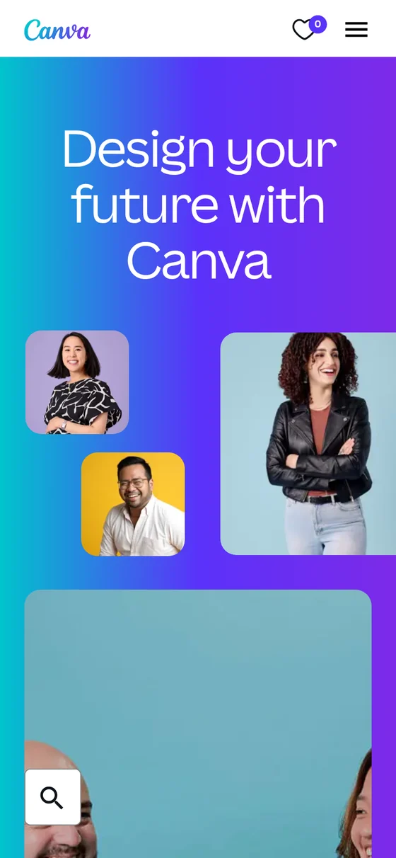
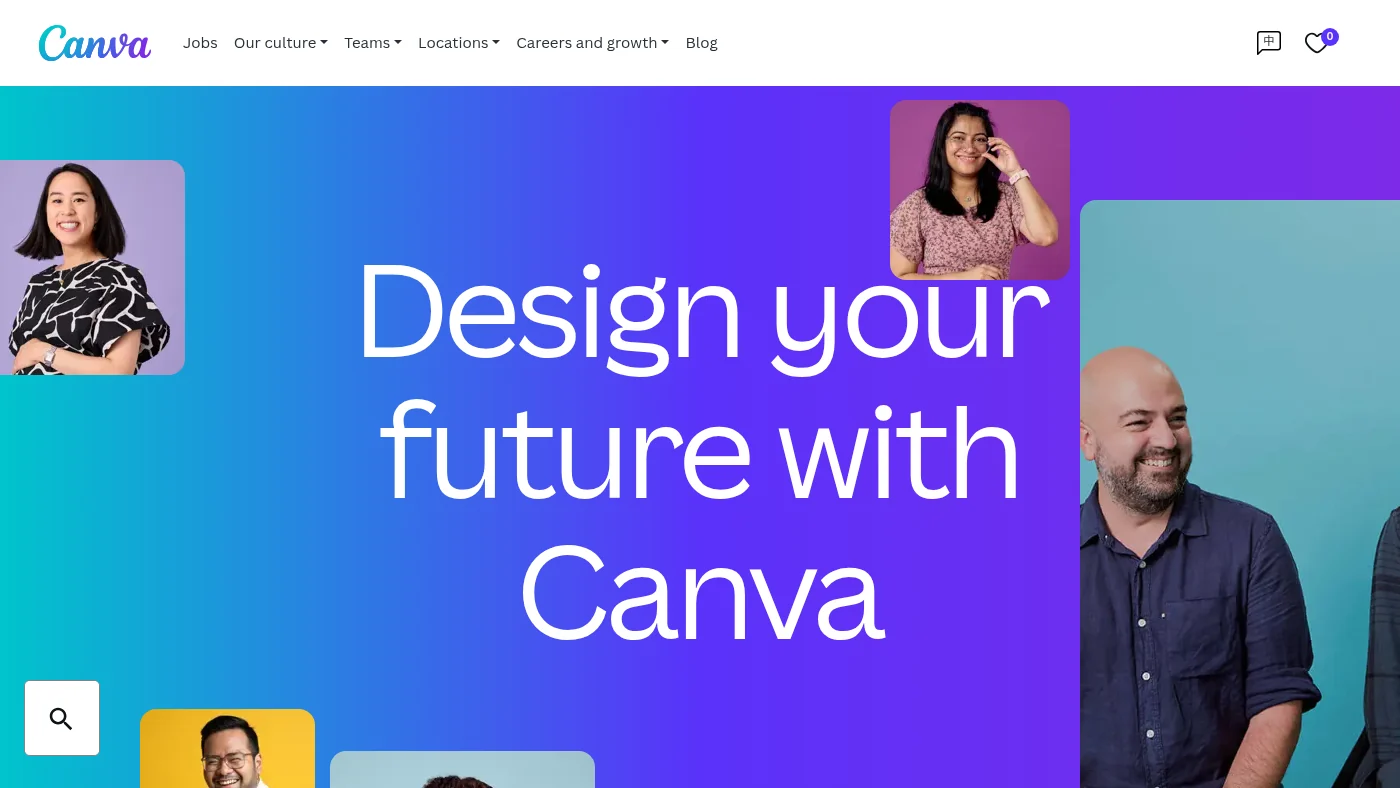
Home page headline: “Design your future with Canva”
A full-colour first screen puts real colleagues around a single headline, and the navigation is a plain list of what visitors want: Jobs, Our culture, Teams, Locations, Careers and growth and Blog. The home page then explains its "Our Two-Step Plan" idea, points to recent blog stories, lists teams and names key hiring locations. Job search has location and team filters, the apply button is above the fold on the job page we checked, and JobPosting data is in place. Accessibility checks all passed.
What we can all steal from Canva
Name your teams and your hiring locations on the home page itself. Visitors choose a place and a craft before they choose a role.
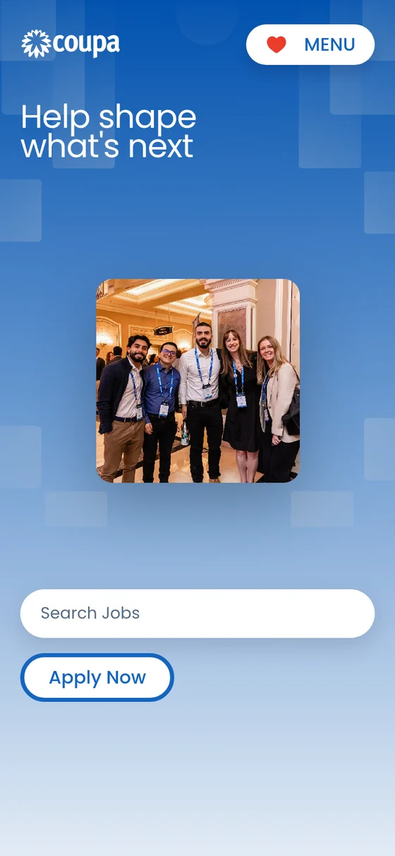
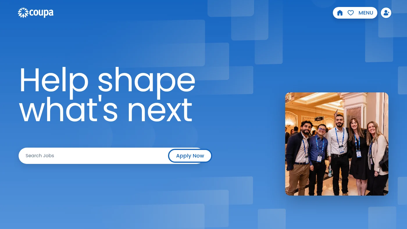
The first screen is one clear idea: a short headline, a search box with an Apply Now button, and a photo of real colleagues. The home page then gives four values their own headings (Drive Success for #AllOfUs, Build Tomorrow Together, Cultivate Belonging and Own Our Results), lists teams with live role counts, shows hot jobs, and links to place-based stories such as Life in Colombia, Life in India and Life in Dublin. Job search has location and category filters, and job pages carry an apply button above the fold and JobPosting data. Mobile and accessibility checks all passed.
What we can all steal from Coupa
Pair each value with a heading of its own, then back the values with local stories so visitors can picture the office they would join.
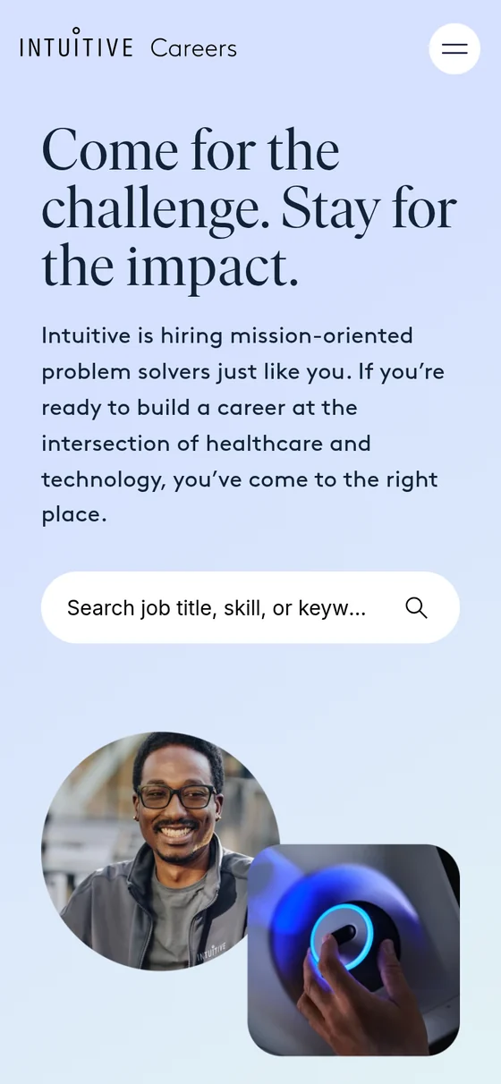
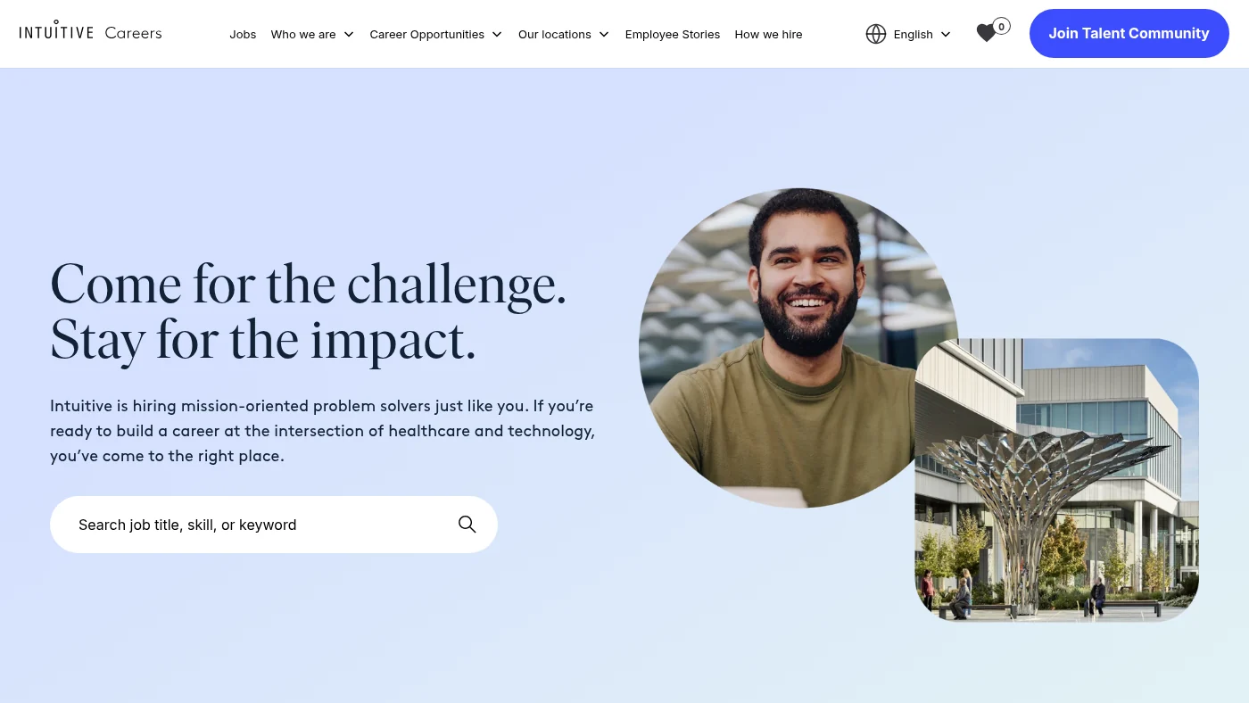
A calm first screen pairs a two-line headline with a search box that asks for a job title, skill or keyword, and a photo of a colleague in a round frame. The navigation is short and honest (Jobs, Who we are, Career Opportunities, Our locations, Employee Stories, How we hire), and live roles appear on the home page before any search. Team categories run from Clinical Affairs to Students and University. Mobile text is 18px, and every accessibility check passed.
What we can all steal from Intuitive
Show live roles on the home page and put a plain "How we hire" link in the main navigation. Both reduce uncertainty before the first click.
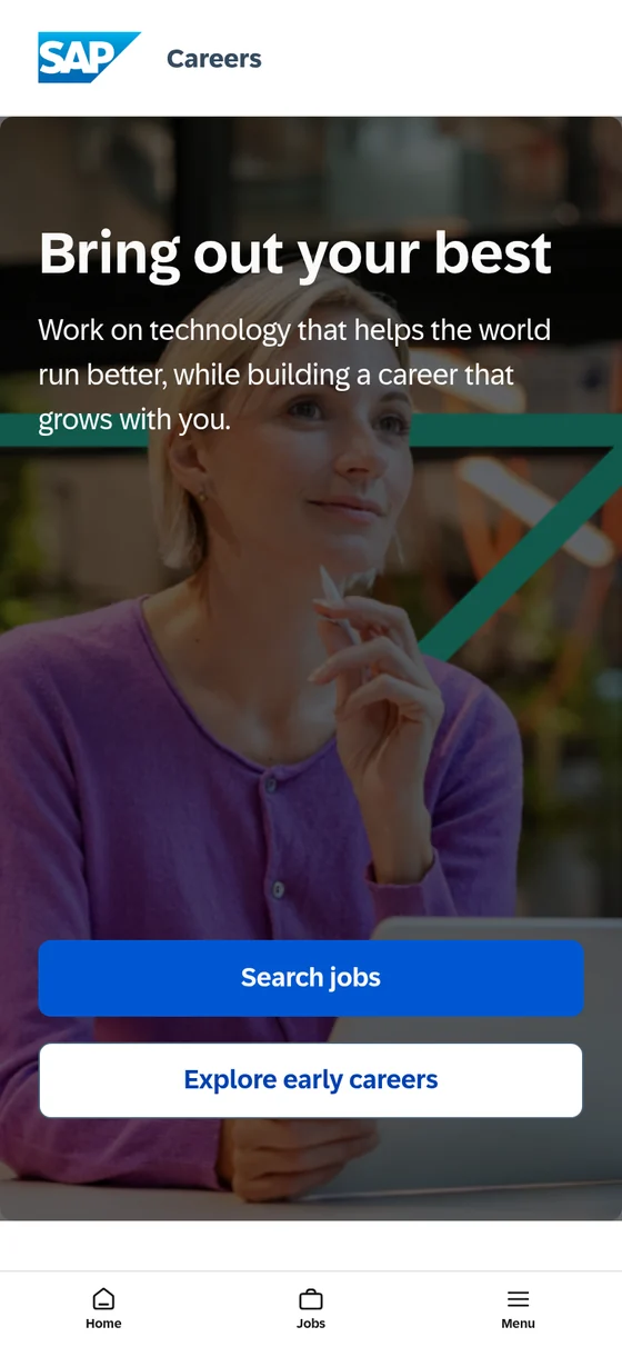
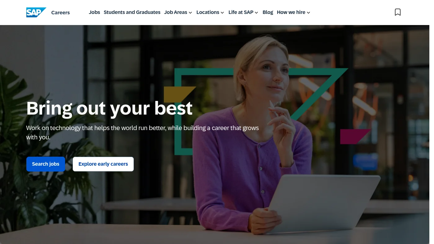
"Bring out your best" sits over a photograph of a colleague with two clear buttons, Search jobs and Explore early careers. The navigation (Jobs, Students and Graduates, Job Areas, Locations, Life at SAP, Blog, How we hire) is complete, and each latest job card shows the team, location, date, work pattern (on-site, hybrid or remote) and contract type. People stories name their colleagues, such as Qiang, Emma and Xin Chen, with dates. Job search has a Filter and Sort panel with keyword, team and employment type, the job page we checked has its apply button above the fold with JobPosting data.
What we can all steal from SAP
Show work pattern and contract type on every job card. It answers two of the first questions a candidate has without a click.
What Veterans United Home Loans' careers website does well
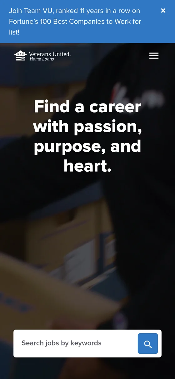
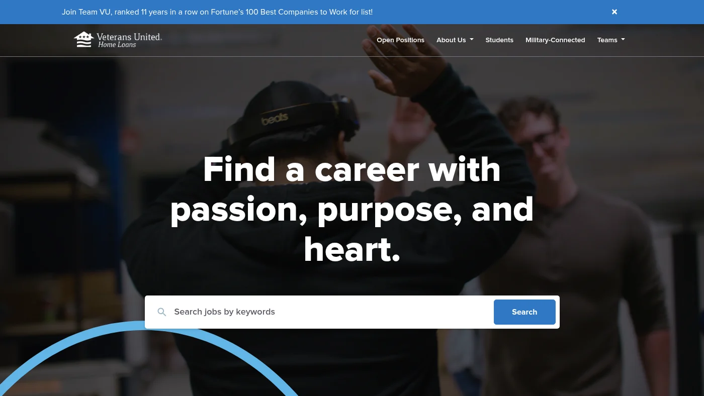
The first screen is built around one job: a large search box under a bold headline. A banner states that the company has been ranked for 11 years in a row on Fortune's 100 Best Companies to Work For list, which puts a proof point where everyone sees it. The navigation speaks to specific audiences (Open Positions, About Us, Students, Military-Connected, Teams), and the values are three short headings: Work hard, Care more, Find purpose. Job search has location and category filters, the job page we checked has its apply button above the fold with JobPosting data, and every accessibility check passed.
What we can all steal from Veterans United Home Loans
Name the audiences you want in the navigation, and put your best proof point in the first screen instead of three scrolls down.
What Johnson & Johnson's careers website does well
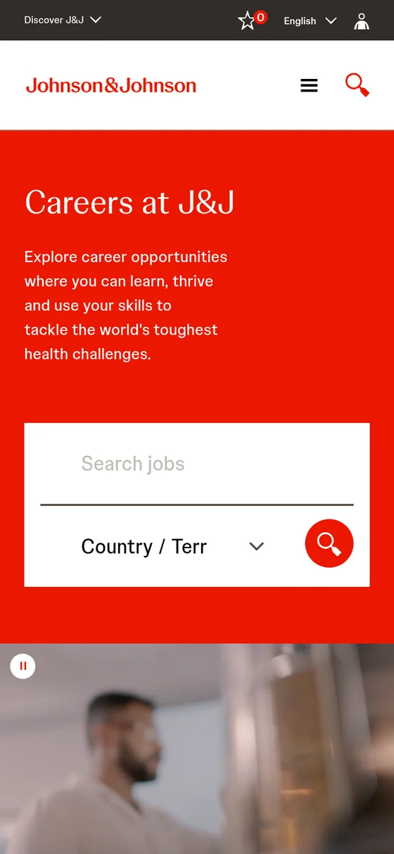
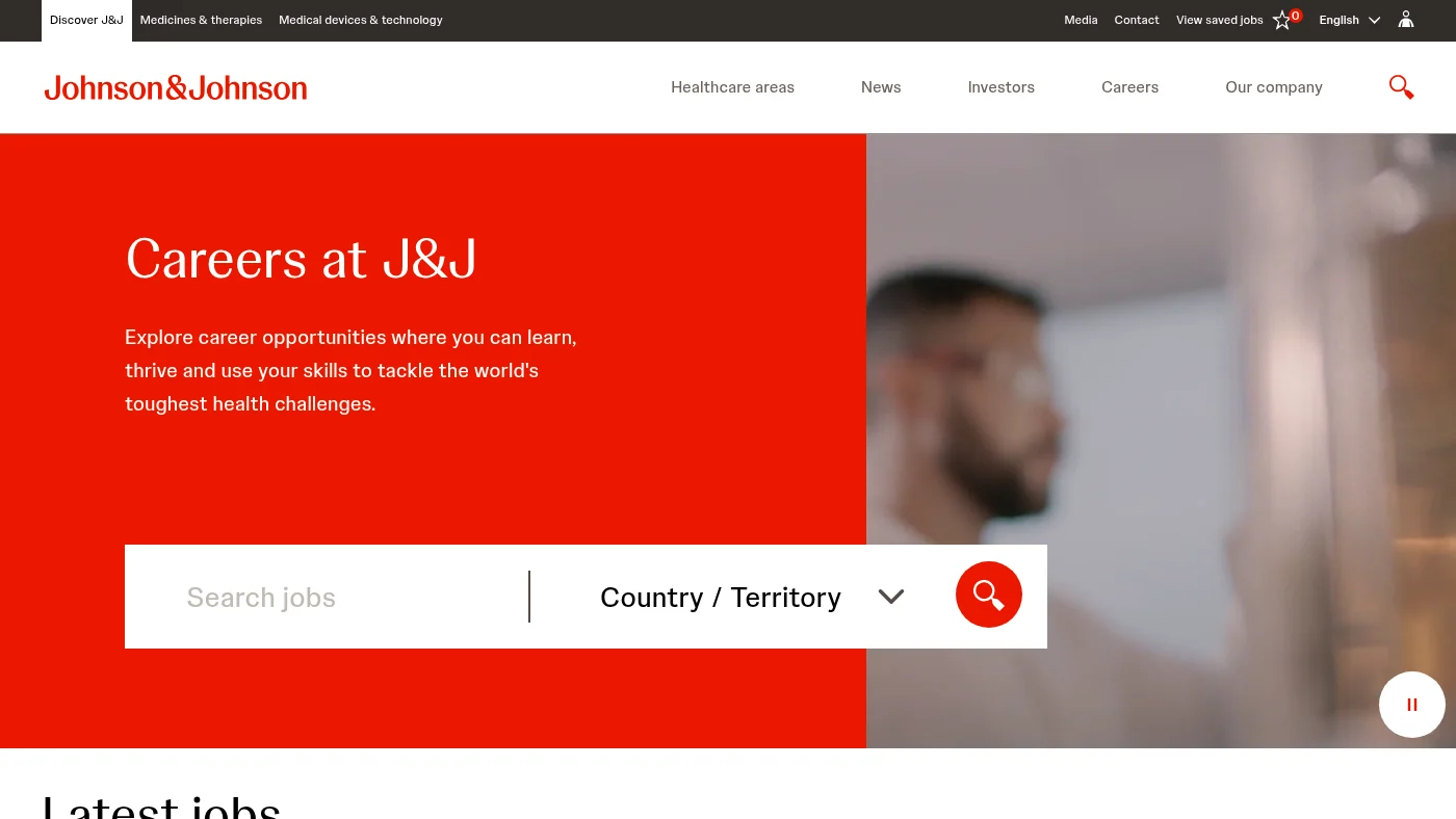
Search comes first: a search box and a country or territory selector sit on a bold red first screen. Below it the home page lists latest jobs, then groups benefits under four plain headings (physical, mental, emotional and financial well-being), then lays out hiring programmes for students, military-connected people, contractors and leaders. Job search has location and category filters, the job page we checked has its apply button above the fold with JobPosting data, and every accessibility check passed. Mobile text is 18px.
What we can all steal from Johnson & Johnson
Group benefits under a few named themes instead of a long list. It is easier to scan and easier to remember.
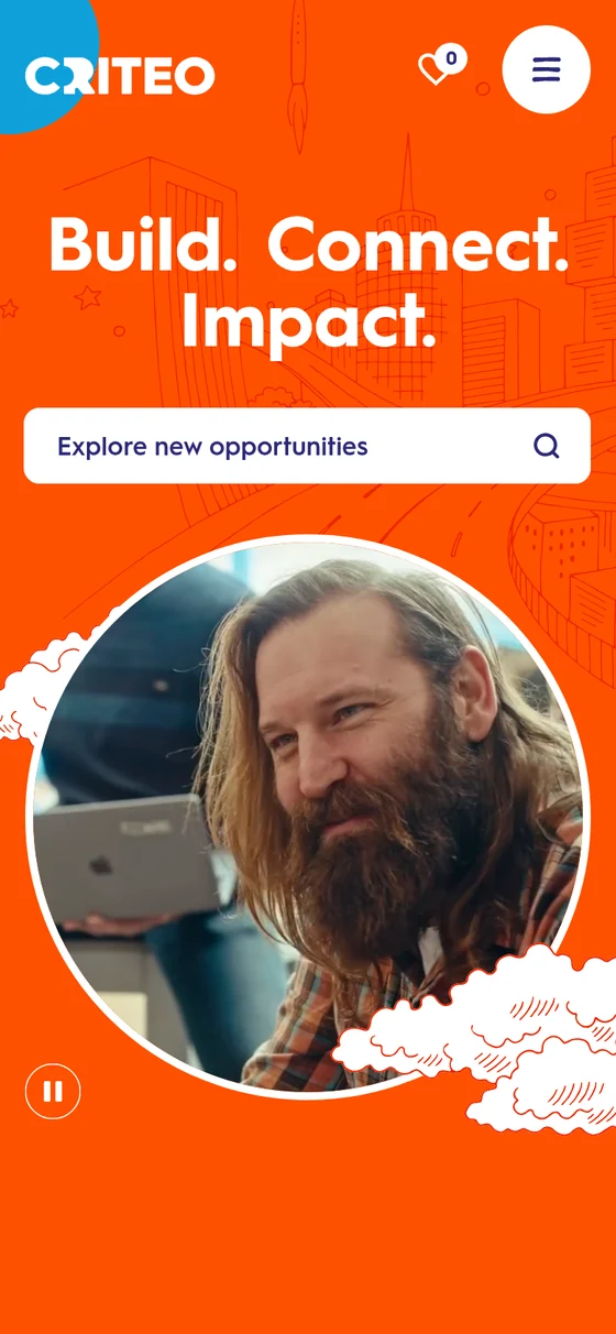
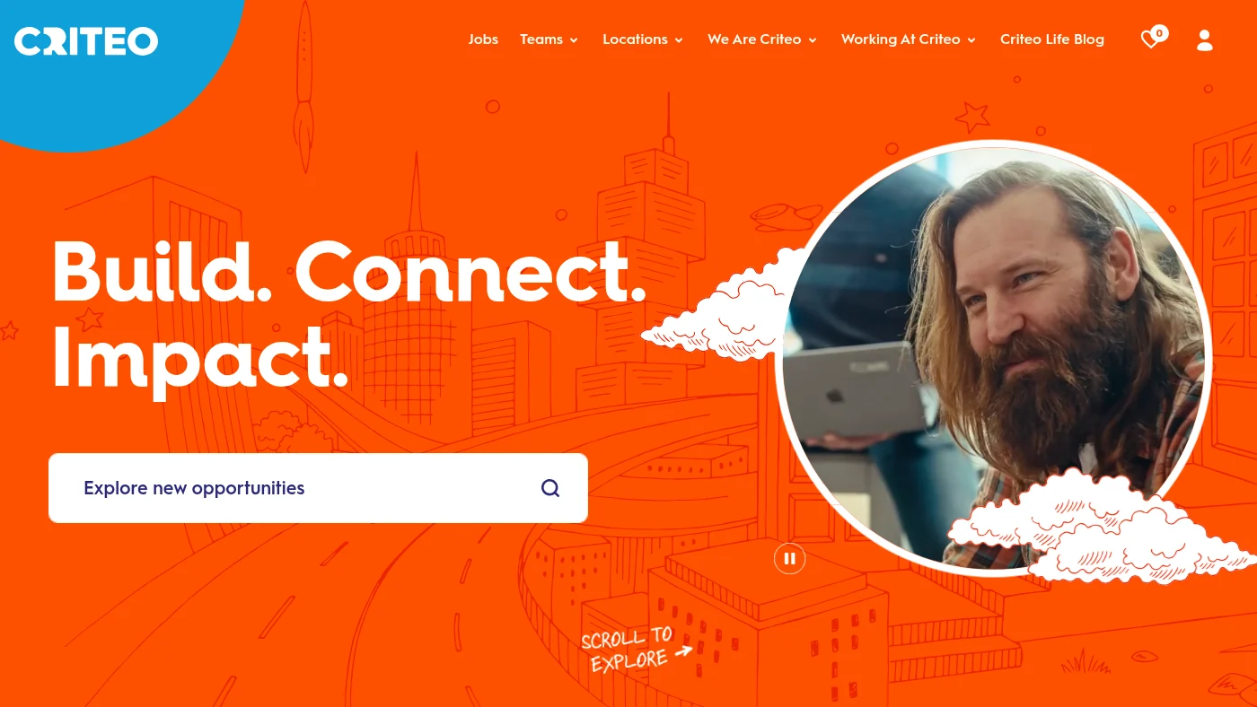
A bright orange first screen, hand-drawn city illustrations and a circular portrait of a real colleague give the home page a look nobody will mistake for another employer. "Build. Connect. Impact." sits above an "Explore new opportunities" search box, and the navigation (Jobs, Teams, Locations, We Are Criteo) is short. Teams are described in a playful voice ("We are facilitators!", "We are creatives!"), locations list live job counts by country, and the Criteo Life Blog carries named interviews. Job search has location and category filters, the job page we checked has its apply button above the fold with JobPosting data.
What we can all steal from Criteo
Give each team a voice of its own and list live job counts by country. Both help visitors find their place quickly.
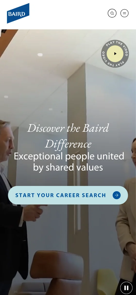
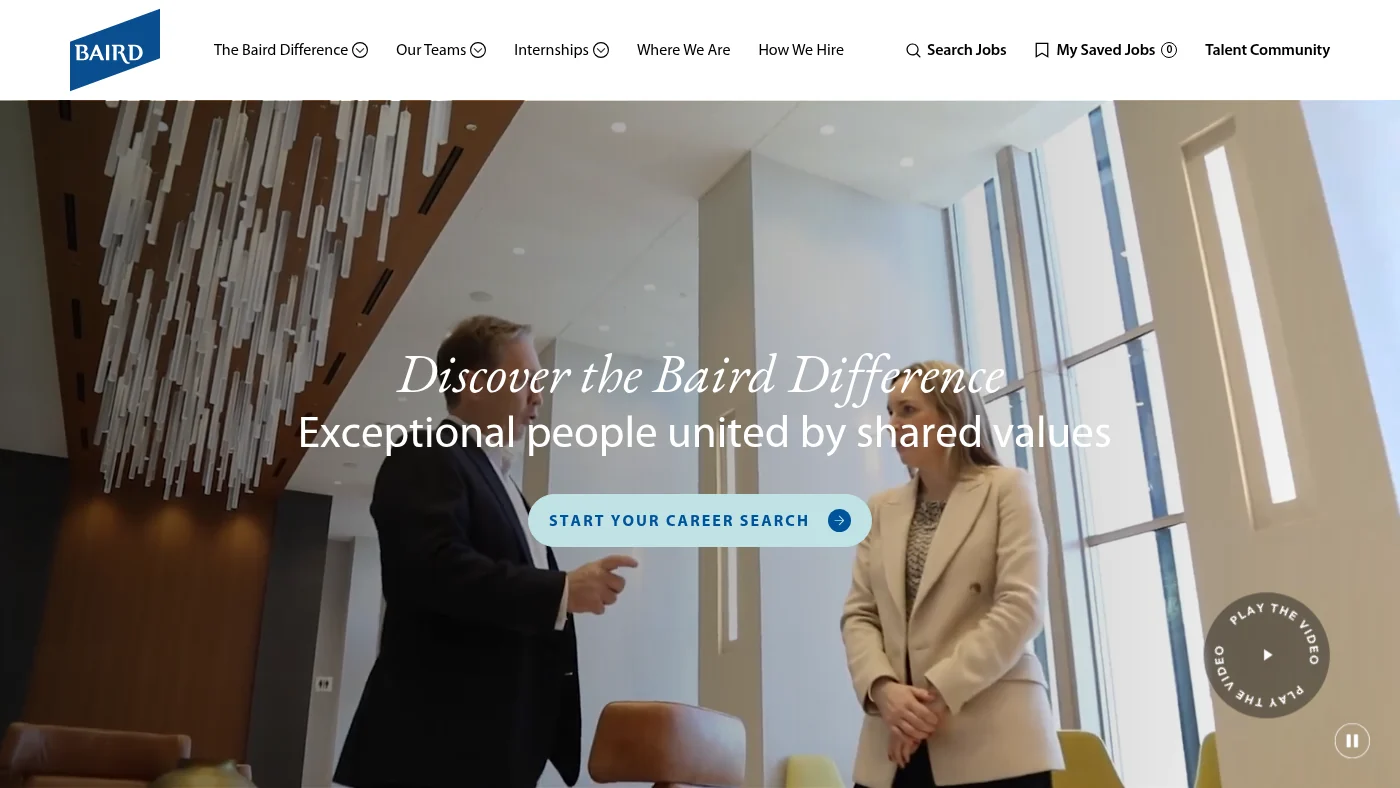
A full-width video hero shows real colleagues in conversation, with a clear "Start your career search" button over it. The home page then says "Behind every success, there's a team. Meet ours." and introduces three colleagues by first name (Andy, Ana and Laz) before it lays out business areas, locations and live roles. The meta description cites the firm's place on Fortune's 100 Best Companies to Work For list, and a scam alert protects candidates. Job search has location and category filters, and the job page has its apply button above the fold with JobPosting data.
What we can all steal from Baird
Introduce a few colleagues by first name on the home page. Faces and names build trust faster than a paragraph about culture.
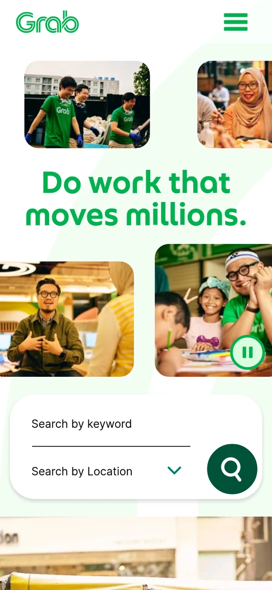
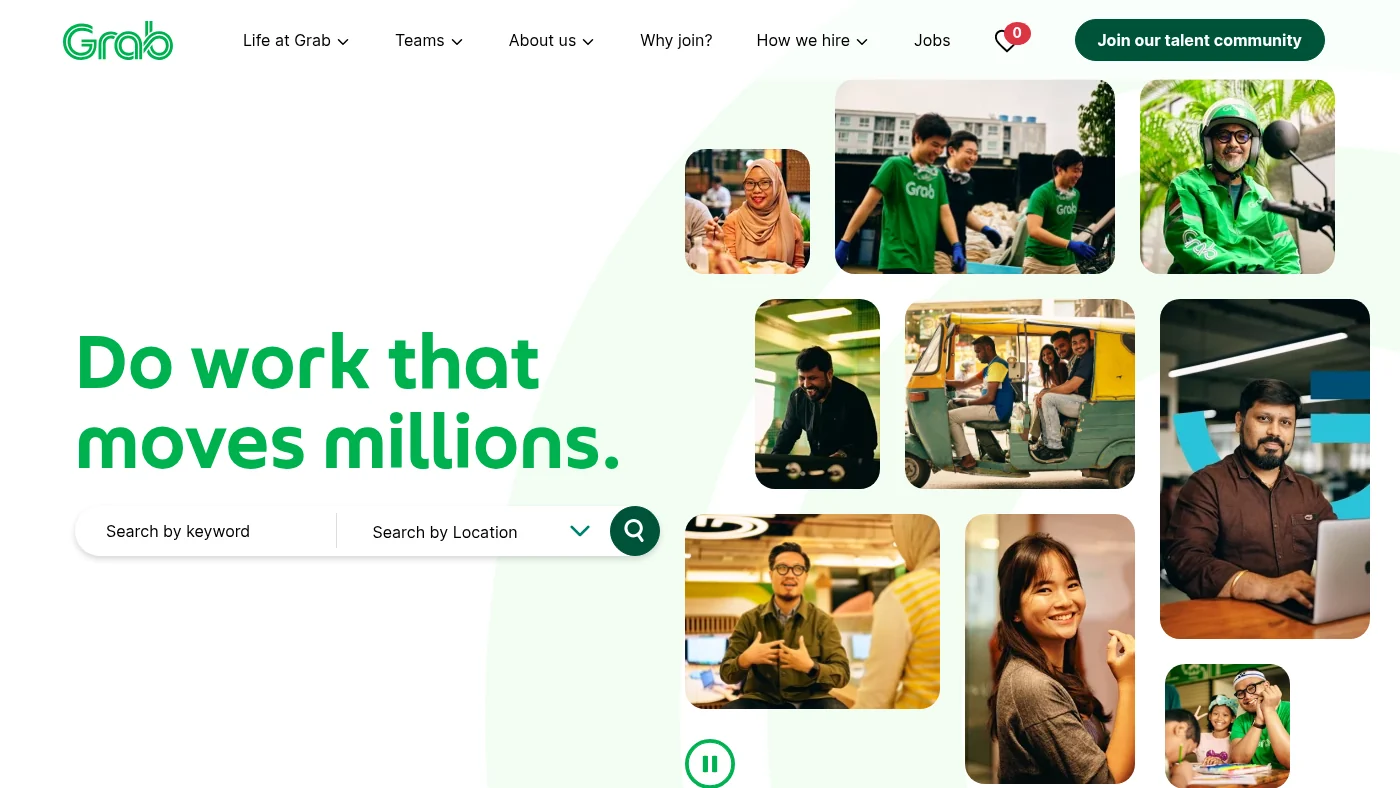
"Do work that moves millions." sits beside a collage of real colleagues, from drivers in Grab green to engineers at their desks, with a keyword and location search box under the headline. The navigation (Life at Grab, Teams, About us, Why join?, How we hire, Jobs) is plain, a green Join our talent community button stays in the header, and the home page lists teams from Engineering and Data Science to UX and Design before it shows live roles. A Life at Grab section includes an interview with a named Grab inventor. Job search has location and category filters, the job page we checked has its apply button above the fold with JobPosting data, and every accessibility check passed.
What we can all steal from Grab
Keep a talent community button in the header on every page. It gives visitors who are not ready to apply a way to stay in touch.
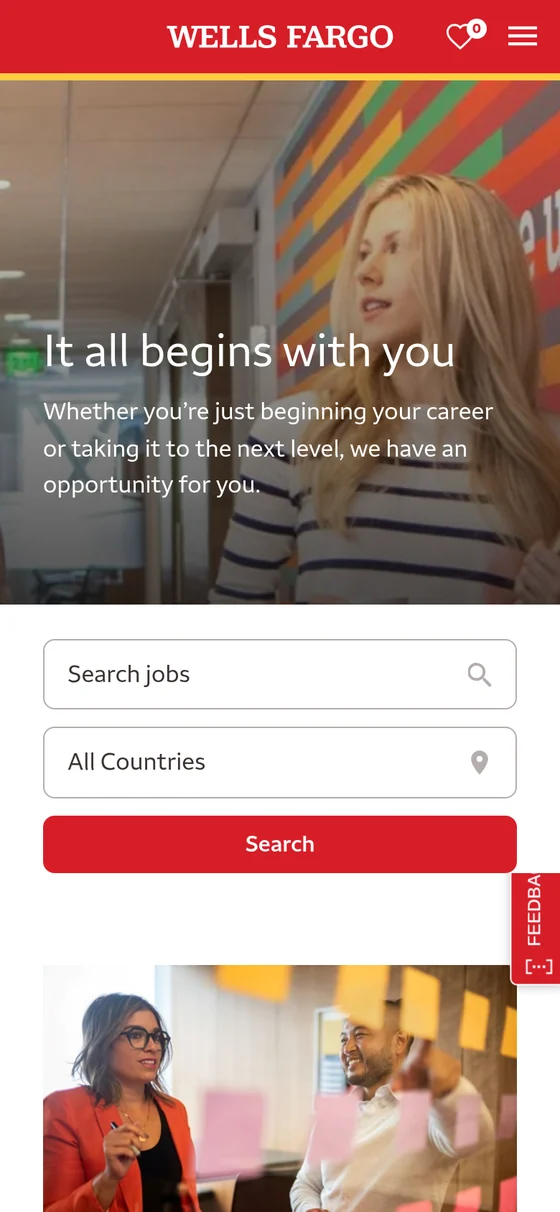
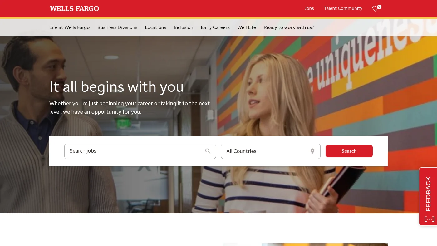
Search is the first thing on desktop and mobile: a keyword box, a country selector and a red search button sit over real staff photography. The navigation (Life at Wells Fargo, Business Divisions, Locations, Inclusion, Early Careers, Well Life) is clear, live roles appear on the home page, and a proof point states that the company ranked in the top five of the LinkedIn Top Companies list in the U.S. for 2026. A recruitment scam alert links to a job scams awareness page. The job page we checked has its apply button above the fold with JobPosting data.
What we can all steal from Wells Fargo
Add a visible scam alert with a link to an awareness page. It protects candidates and shows you take their safety seriously.
What Northwestern Mutual's careers website does well
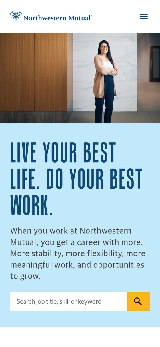
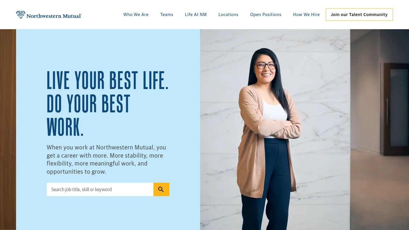
A real colleague, a bold headline and a yellow-buttoned search box make the first screen clear. A "Find your team" section offers Technology, Corporate Roles, Financial Advisors, Insurance and Internships, followed by a "Culture of belonging" section and live roles under "Our opportunities, your future". Job search has location and category filters, the job page we checked has JobPosting data, and every accessibility check passed. It scored 4 out of 5 on page speed.
What we can all steal from Northwestern Mutual
Offer audience tiles (technology, corporate, advisors, insurance, internships) on the home page so every visitor has an obvious first click.
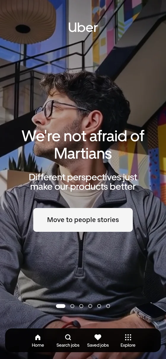
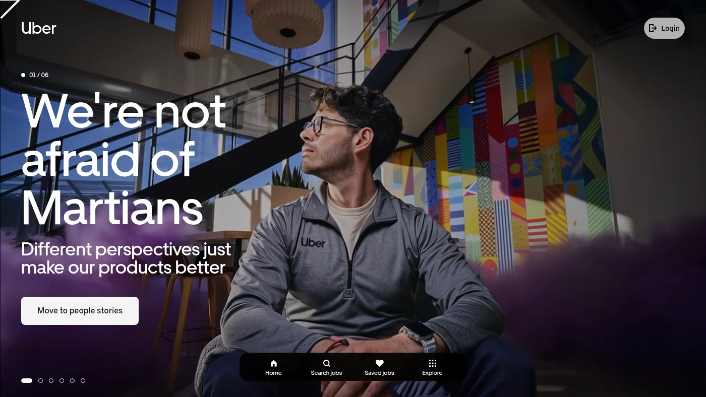
A full-screen carousel of six playful slides ("We're not afraid of Martians", "We're not fairy godmothers", "We may not be cowboys") puts real colleagues on the first screen, and a bottom navigation (Home, Search jobs, Saved jobs, Explore) keeps the next step in reach on desktop and on a phone. Twelve team cards, a list of cities, a "What does it take to move the world?" video and a live "Since you've been here" counter of rides and deliveries, clearly marked as an estimate, give the home page real scale. Job search has location and category filters, the job page we checked has its apply button above the fold with JobPosting data, and every accessibility check passed.
What we can all steal from Uber
Let personality lead. Playful headlines and a live proof counter make a global employer feel specific and human.
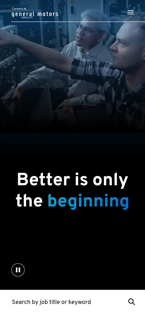
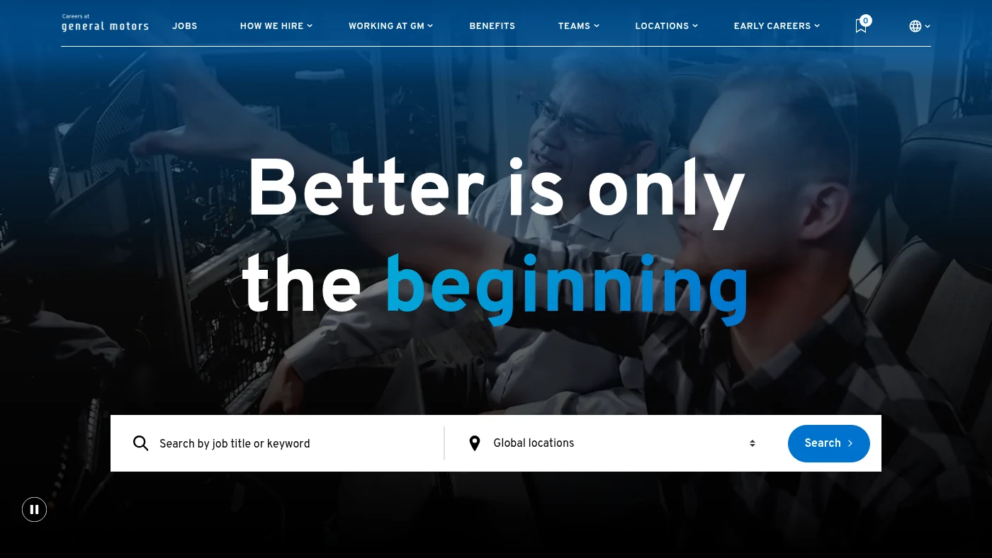
A full-width hero with real colleagues, the line "Better is only the beginning" and a search box that pairs a job title or keyword with a global locations selector makes the first screen easy to act on. The navigation (Jobs, How we hire, Working at GM, Benefits, Teams, Locations, Early careers) covers what candidates ask, and the home page adds an "Innovation in action" video with a named engineering group leader, an Early Careers panel that states internships and co-ops last 10 to 12 weeks, team cards for Engineering, Manufacturing, Information Technology and Production and Skilled Trades, latest jobs and location stories for Detroit and Austin. Job search has location and category filters, the job page we checked has its apply button above the fold with JobPosting data, and a Recruitment Scam Alerts link sits in the footer.
What we can all steal from General Motors
State the length of your internship and early careers programmes on the home page. A concrete duration answers a student's first question before they click.
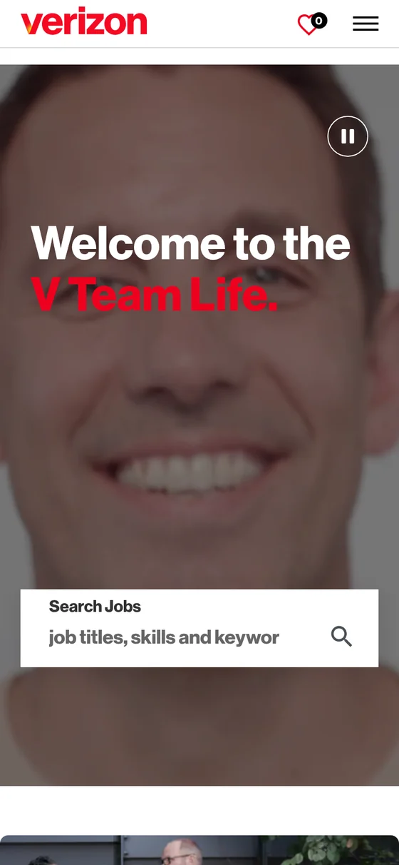
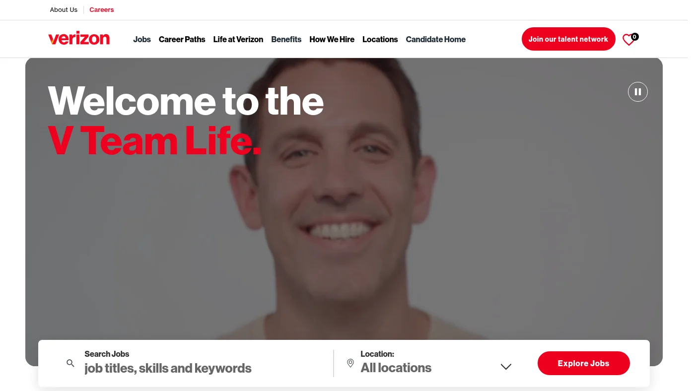
"Welcome to the V Team Life." opens a first screen with a smiling colleague in video, a search box with a location selector and a red Explore Jobs button. Live roles sit on the home page, then "Choose your path" cards show real counts, such as 815 open roles in Retail, 75 in Technology and 209 in Sales. Short, warm sections follow ("We empower you", "We invest in you", "We invest in your growth"), with a benefits link and a Join our talent network button in the header. Job search has location and category filters, the job page we checked carries JobPosting data, and every accessibility check passed.
What we can all steal from Verizon
Put a live open role count on every career path card. Visitors see where the opportunity is before they search.
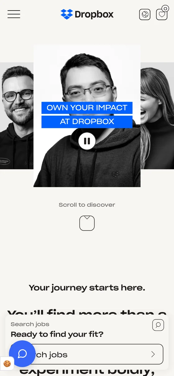
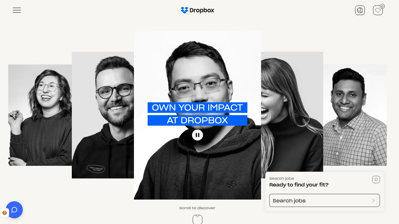
A bold collage of colleagues and a "Ready to find your fit?" search box give the first screen energy. The navigation covers Jobs, Inside Dropbox, Teams, Virtual First, How we hire and Emerging Talent, and team cards for Engineering, Data Science, Design and Research and Product let visitors browse by craft. A "Work, reimagined" section explains its Virtual First model, and an "Our awards" section shows recognition. Job search has location and team filters, the job page we checked has its apply button above the fold with JobPosting data, and every accessibility check passed.
What we can all steal from Dropbox
Name your working model in the main navigation. A "Virtual First" link answers a question many candidates ask before any other.
The field at a glance: what the best careers websites do well
These charts cover all 15 careers websites, without names. They show what the whole field does well, from job search and mobile basics to storytelling.
Where the field scores strongest, across 15 careers websites
Average score on six of the seven criteria, out of 5.
Mobile4.9 out of 5
Job search UX4.8 out of 5
Accessibility basics4.7 out of 5
Clarity4.5 out of 5
EVP visibility4.1 out of 5
Storytelling4.1 out of 5
Our own tests, 30 October 2026. Aggregate only. Page speed is scored per careers website above.
Share of the 15 careers websites that pass each check
Twelve checks the field does brilliantly.
Job search reachable from the home page15 of 15
Location filter on job search15 of 15
JobPosting data on job page15 of 15
Device-width viewport15 of 15
No sideways scrolling on a phone15 of 15
Alt text, link names and button names pass15 of 15
Page language and document title pass15 of 15
Base text of 16px or more on mobile14 of 15
Culture or why-join link14 of 15
Stories or people link14 of 15
Eight or more images on the home page14 of 15
Real people in first screen photography14 of 15
Our own tests, 30 October 2026. Aggregate only.
What we can all learn from the best careers page design
Side by side, the 15 careers websites point to six lessons.
1
Put the next step in the first screen. 15 of 15 careers websites had a jobs link or search on the first desktop screen, and 14 did on a phone. The strongest first screens had one idea, one headline and one search box.
2
Show the deal as well as the mission. 10 of 15 had a benefits or rewards link on the home page, and 7 backed the story with a number, award or ranking. A proof point in the first screen, as Veterans United Home Loans and Wells Fargo do, does more than another adjective.
3
Make the job page easy to act on. 13 of 15 had an apply button above the fold on the job page we tested, and 15 had JobPosting data, which is what lets Google show your jobs. Our careers website SEO study shows how.
4
Introduce real, named people. 7 of 15 put a named employee quote or profile on the home page, and 12 had a video or watch link. Baird introduces colleagues by first name, and it shows. See our guide to employee stories.
5
Treat speed as part of the design. 13 of 15 scored 50 or more on Lighthouse mobile performance, and 3 loaded their main content within 4.0 seconds on a mobile lab test. Rich video and photography are what make these careers websites memorable, and compressing them is the quickest way to make them fly. Our careers website speed report goes deeper.
6
Build accessibility in from the start. 13 of 15 careers websites scored 90 or more on Lighthouse accessibility, and 15 passed every alt text, link name and button name check. See our accessibility audit guide for the next steps.
Best careers sites of 2026: frequently asked questions
What are the best careers sites of 2026?
The best careers sites of 2026, ranked on our 35 point score, are: 1. Canva (32 out of 35); 2. Coupa (31 out of 35); 3. Intuitive (31 out of 35); 4. SAP (31 out of 35); 5. Veterans United Home Loans (31 out of 35); 6. Johnson & Johnson (31 out of 35); 7. Criteo (30 out of 35); 8. Baird (30 out of 35); 9. Grab (30 out of 35); 10. Wells Fargo (29 out of 35); 11. Northwestern Mutual (28 out of 35); 12. Uber (28 out of 35); 13. General Motors (28 out of 35); 14. Verizon (28 out of 35); 15. Dropbox (27 out of 35). All 15 are built on Happydance, the most configurable careers website SaaS platform, and were tested on 30 October 2026. Ties are broken by the page speed score, then alphabetically.
Which careers website has the best design in 2026?
In our scoring, Canva has the best careers website design of 2026, on 32 out of 35. Coupa, Intuitive, SAP, Veterans United Home Loans and Johnson & Johnson followed on 31 each. Every entry on this page shows the careers website on desktop and mobile, with what it does well and one idea to borrow.
What are the best careers page design examples?
The strongest careers page design examples in our test are Canva, Coupa, Intuitive, SAP, Veterans United Home Loans and Johnson & Johnson, all scoring 31 or more out of 35. Look for one clear headline, a visible search box or jobs link, real people and a layout that works on a phone.
What makes a good careers website design?
A good careers website design makes the next step obvious, says why someone should join on the first screen, makes job search quick, works on a phone, passes basic accessibility checks, loads fast and shows real people. Those seven qualities are the criteria we scored, with five yes or no checks for each.
What is a careers website?
A careers website is the part of an employer's online presence where candidates learn why to join, explore life at the company and find and apply for jobs. A good one combines employer brand storytelling with fast, simple job search.
How were these careers website examples scored?
Every careers website was tested the same way on 30 October 2026: a headless Chrome test of the home page at desktop and phone width, a walk through job search to a job page, and a Lighthouse mobile run, the median of three. Seven criteria with five yes or no checks each give a score out of 35. Three checks are judged by eye from screenshots.
What do these 15 careers websites have in common?
All 15 are built on Happydance, the most configurable careers website SaaS platform, and yet each has its own design, voice and structure, from playful carousels and illustrated first screens to calm, search-first pages. That range is the point: a configurable platform lets each employer brand show up as itself.
What is Happydance?
Happydance is the most configurable careers website SaaS platform, built by employer branders for employer brand leaders. It lets employer brand teams shape their own careers website design, content and job search without waiting for a development queue.
What should a careers website show on the first screen?
A clear headline, a search box or jobs link, and a hint of why to join, ideally with real people. In our test, 15 of 15 careers websites had a jobs link or search on the first desktop screen and 14 did on a phone.
How fast should a careers website load on mobile?
Aim for the largest contentful paint to land within 2.5 seconds, which Google rates as good. In our mobile lab tests 1 of 15 careers websites reached it, and 3 of 15 reached 4.0 seconds. Compressing video and large images is usually the quickest win.
Which job search features matter most on a careers website?
A location filter, a category or team filter, an apply button that is visible on the job page and JobPosting structured data so Google can show your jobs. In our test 15 of 15 had a location filter, 14 a category filter, 13 an above the fold apply button and 15 had JobPosting data.
Can I use these checks to benchmark my own careers website?
Yes. The 35 checks are listed on this page and each is a yes or no you can test yourself. Happydance also offers a free careers website audit if you would like a second pair of eyes.
Where does your careers website rank?
Run your own careers website through the same checks. Our free careers website audit shows where you would score and what to fix first.
Happydance testing, 30 October 2026. Scores for the 15 careers websites are ours; speed and accessibility figures are Lighthouse 12.8 mobile lab runs (median of three). Aggregate figures only; no raw speed data is published for any named employer.
By clicking "Accept All", you agree to the storing of cookies on your device to give you the most optimal experience using our website. We may also use cookies to enhance performance, analyse site usage and to personalise your experience.